 Strewn
How to make an aesthetic photo dump
An aesthetic photo dump looks cohesive because its slides share a few things: a limited palette, similar light, one frame shape and a color order that flows from slide to slide. You do not need filters. You need to choose photos that agree and sort them so neighbors hand off their colors.
Coming soon to iPhone

What makes a photo dump look aesthetic?
Repetition. A dump looks designed when the eye keeps meeting the same few choices: warm tones, or cool ones; soft daylight, or night flash; the same border; the same frame shape. Viewers rarely name these things. They just feel that the post belongs together.
Four levers do most of the work: the palette of the photos you choose, the brightness of those photos, the frame every slide sits in, and the order in which the colors appear. You can change all four without editing a single pixel.
How do I choose a palette?
Scroll your week and notice which colors keep showing up. Autumn weeks lean orange and brown, summer weeks lean blue and green, and a week of rain is mostly gray and silver. Pick a direction and select photos that fit it, even if a few good ones get left out.
A simple method is to name the palette in two words before you choose: warm and golden, cool and quiet, green and fresh, black and white with one red. Then cut anything that argues with that sentence. The color scheme basics still apply: a few related hues plus one accent look planned.
Does matching brightness matter?
More than most people expect. A dump that jumps from a bright noon beach to a dim bar photo shows the jump even when the colors agree. Try to keep slides within a similar range of light, and place any outliers deliberately.
Strewn reads average brightness and contrast from a small preview of each photo, and it uses them to decide roles: soft low-contrast frames become breathers, bright busy ones become energy slides. Matching in your own selection first makes the proposed order cleaner.
What is color flow ordering?
Color flow sorts slides by hue so each one hands its color to the next. Strewn starts from the hue of the opener and walks around the color wheel, and it pushes photos with very little color, such as black and white shots, to the end because they have no hue to follow. It is a Pro order in Strewn.
The effect is a gradient across the swipe. A sunset, then a peach wall, then a red jacket, then a pink drink. Neighbors look related even when the subjects have nothing to do with each other. For a themed dump it is hard to beat. For a trip that should read as a day, a timeline order is usually better.
Which frame shape and border should I use?
Choose one and keep it for every slide. Strewn gives every slide a consistent frame: 4:5 with a white border on the free plan, with 1:1 and 3:4 shapes and cream or black borders available in Pro. 4:5 fills the most screen in the feed. A warm cream border suits soft, film-like dumps, and black suits high-contrast night photos.
Mixing shapes inside one carousel gets cropped by Instagram anyway, so a single frame also protects you from surprises. The carousel size guide explains the details.
How do I sort the slides for flow?
Follow this routine on any tool:
- Lay out all chosen photos in a row, at thumbnail size.
- Pick the sharpest, boldest one as slide 1.
- Move to the photo whose dominant color is closest to slide 1 and put it next.
- Keep going, avoiding two near-identical colors in a row.
- Place the calmest, warmest photo last.
- Swipe through once on your phone and fix any jump that makes you wince.
Should I use filters or presets?
If you like them, apply one preset to every photo, at low strength. Mixed edits are the common mistake: one slide boosted, another flat, a third with a different tint. Strewn does not edit photos, so whatever look you apply in your camera app or editor carries through untouched.
Many dumps look best with no filter at all. Honest daylight and a good selection make the post feel current, and the unpolished feel is part of the format. See what a photo dump is for why it leans that way.
Do I need to mix in a loose photo?
Yes, even in a cohesive dump. One slightly off frame around slide 4 keeps the post from looking like an ad. Pick a loose photo that still fits the palette so it reads as casual and not as a mistake.
What about the caption and the last slide?
End on warmth and calm, and keep the caption small. A short list of words matches a tidy visual better than a paragraph. Read photo dump captions for formats that fit.
Strewn picks the warmest, lowest-contrast photo for the closer and offers six caption prompts, such as three words for this week or song on repeat. You write the words yourself. Nothing is generated.
Which aesthetic styles are easy to copy?
A style is just a set of repeated choices. Four are easy to pull off with an ordinary camera roll and no editing skills at all. Pick the one that matches the photos you already have, then select toward it.
- Warm and golden: late afternoon light, wood, bread, skin tones, orange and cream colors.
- Cool and quiet: blue hour, rain, gray streets, glass, steel, a single pale yellow accent.
- Green and fresh: parks, plants, markets, salads, daylight through leaves.
- Black and white with one color: mostly neutral frames and one slide with a loud red or yellow.
How many photos should share the palette?
Roughly eight in ten. A palette that covers every slide looks stiff and can make the post feel staged. Allow two or three slides to step outside it, and place them away from each other so they read as accents. The loose chaos slot is a natural home for one of them.
If you only have six photos in the palette you want, that is fine. A seven-slide dump with a clear look beats a twelve-slide one with no direction. Add the rest later in a second post.
What about text and stickers?
Keep them rare. A single serif title on a collage, or a date in the corner of one slide, gives structure. A dozen stickers over every photo makes the post look noisy and hides the palette you worked to build. Strewn's collage title is a toggle for one serif headline such as Week 41, strewn, and nothing more.
Where does Strewn fit in this?
It does the first pass: reading sharpness, light and color, proposing a story arc, and letting you try Color flow in Pro. It is in development and not on the App Store yet. Meanwhile, the method above works with any gallery.
See how the order works for the roles and the rules behind them.
Frequently asked questions
How do I make my photo dump look aesthetic?
Limit the palette, keep brightness similar, use one frame shape and order slides so neighboring colors relate.
Do I need filters for an aesthetic dump?
No. A consistent selection and order matter more. If you use a preset, apply the same one at low strength to every photo.
What is the best order for color?
Start with the boldest photo, then walk around the color wheel so each slide hands its hue to the next. Put low-color photos at the end.
Should every slide be the same shape?
Yes. One frame, such as 4:5 with a white border, keeps the carousel looking planned and avoids unexpected cropping.
Can an aesthetic dump still have a blurry photo?
Yes, and it helps. Choose a loose photo that fits the palette and place it around slide 4.
Keep exploring
Photo Dump OrderA slide-by-slide order template for a 10-photo dump.Photo Dump OrderA story-arc order with a reason for every slide.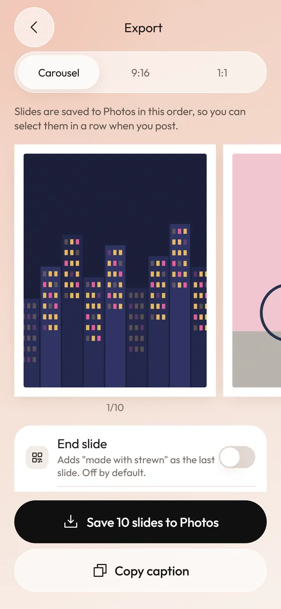 Photo Dump IdeasThirty things worth putting in a photo dump, sorted by the job each one does.Photo Dump Carousel and Collage Export for StoriesCarousel slides, a 9:16 teaser and a 1:1 collage.